Is this the world you believe you live in?
 |
|
|
|

 Thanks: 0
 Likes: 0
 Dislikes: 0
 Got Soul, Not A Soldier

 Array
Got Soul, Not A Soldier
Array
Array
Got Soul, Not A Soldier
Array
okay. well let me start debunking your perception a little bit at a time. firstly with this...

Forum Greatest Of All Time

 Array
Array
looks familiar
Don't bully fat kids - they've got enough on their plate
Got Soul, Not A Soldier
Array
right it looks familiar, and we all assume it is factually correct. but for many reasons, which we can get into later...it is not even close to accurate with the amount of land mass designations.Originally Posted by Mark TKO

Now before I provide proof, it is fair to assume that Greenland is roughly the same size as Africa, correct?
but in reality...
Africa is 14x times bigger then Green land.
But who cares about Greenland, amirite? How about the rest of the world, surely that must be accurate to these maps as we understand them?
Last edited by Youngblood; 10-16-2010 at 08:08 PM.
Forum Greatest Of All Time
Array
apologies I first viewed this thread in IE7 and the second post didn't load up properly
in firefox now and can see what you are getting at - let me look at it some more and I will be back
Don't bully fat kids - they've got enough on their plate
Got Soul, Not A Soldier
Array
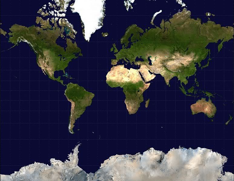
This first map is known as the Mercantor Project Map, and is the most widely used and recognized map in the world.
This below is the Peters Projection. Much less used but far more accurate in terms of size of relative continents and mass.

Got Soul, Not A Soldier
Array
A bit of the explanation, thanks to the tv show The West Wing...
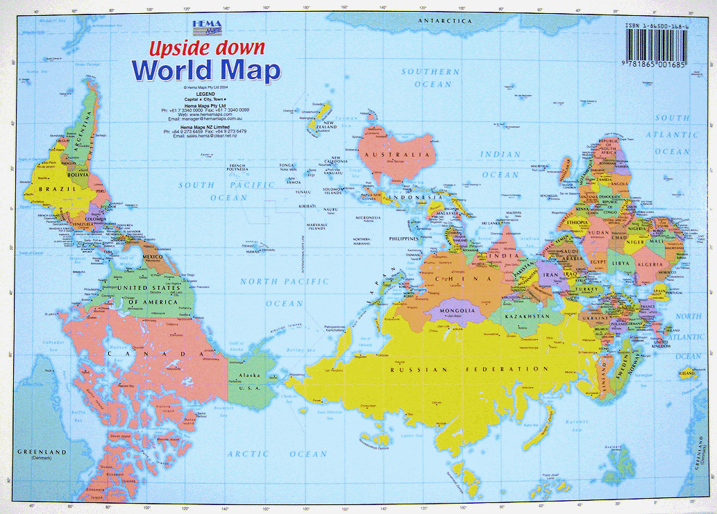
another perception:
There are currently 1 users browsing this thread. (0 members and 1 guests)

 Reply With Quote
Bookmarks